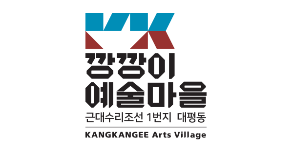
Symbol Mark
At first, we used the combination of the English “KK”in order to remind us of the sound of “Kang-Kang”, which is the origin of the name, “KANGKANGEE”, representing Daepyeong-dong. Then, a shape of boat is expressed through the design process of filling or leaving a blank in order to show the characteristic of Daepyeong-dong as the mecca of ship-repairing that repeats the process of ‘breaking-assembling, and assembling-breaking’. Moreover, the colors are blue and red, which symbolizes the ship.
Logotype
A graphical style font was used to describe the analog and retro characteristic of Daepyeong-dong, where there are still many skilled workers and engineers who have made small parts by hand. Furthermore, the circular strokes, as well as other strokes, are variously angulated to make the consonant-vowels seem like one small part of ship.

Character ‘Suri’
The character of KANGKANGEE Arts Village, “Suri”, is picked up from the first two letters of the ship-repairing, which is Suri-Josun in Korean. It is a friendly personification of the shape of the ship. As the ship is repaired through the repetitive process of breaking and assembling, the character ‘Suri’ is also possible to transform into various shapes through assembling and breaking.